Introduction
Most modern apps live in the cloud, and are divided into many small pieces. Komodor is a tool that tracks changes in these pieces and helps find and solve problems caused by those changes. Komodor saves developers many hours of work, but it requires an installation. There was an ongoing attempt in the company to switch from a manual installation with a sales representative support to self-served installation.
What was wrong
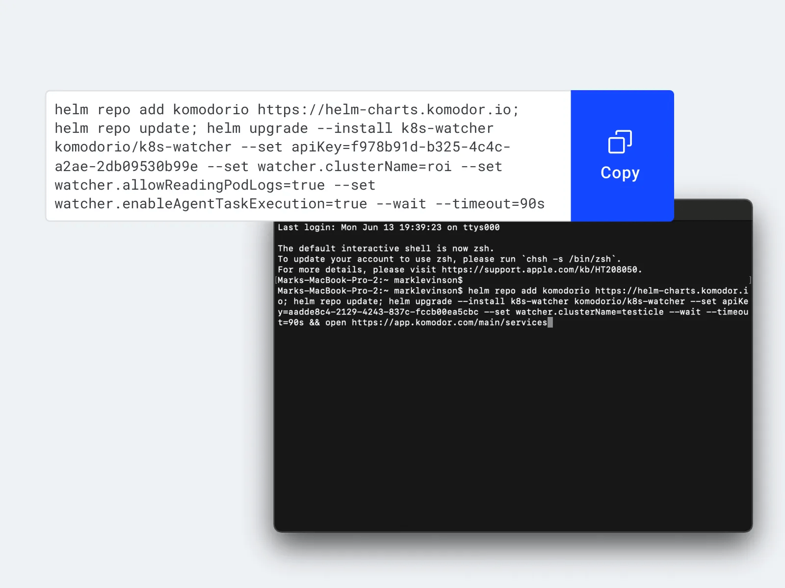
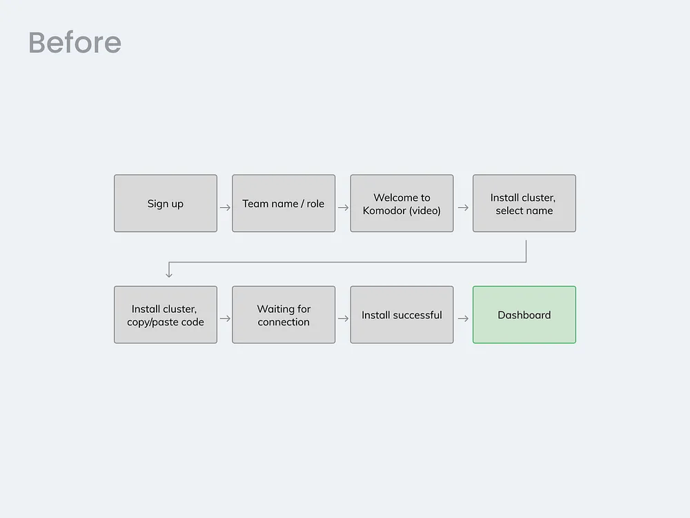
The users hesitated too much about installing our agent (they still do). After the first week of rolling out Komodors’ self-serve installation, we discovered a significant drop-off in Komodors’ onboarding process, up to 88% of users did not do what we wanted them to do–install the agent on their system. Agent install is a developer-only territory, requiring familiarity with Helm environment and commands (That black screen with code all developers seem to fancy so much). So a big technological barrier here. The solution was split into 3 parts.
1. Sandbox development
What was wrong
Komodor is complex, it’s a tool that requires the level of knowledge and familiarity of a mid-level developer. Komodors’ sign-up mandates a helm command install of an agent, and no one likes to install things on their system including skilled developers. When a developer sees a requirement to install something, they hesitate. The install helm command may interfere with their servers, system, and god knows what else.
How it improved the situation
It’s pure psychology: a test drive in a car convinces a potential buyer to purchase much better than just looking at that car from the outside! It’s much easier to arrive at a decision to install an agent after getting to feel the product, to give it a test drive. The sandbox allowed the hesitant user to give Komodor a test drive, after which they were better convinced to install.
2. Agent install modal
What was the problem?
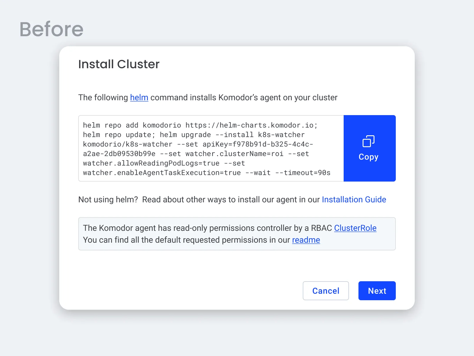
Komodor is complex, it’s a tool that requires the level of knowledge and familiarity of a mid-level developer. Komodors’ sign-up mandates a helm command install of an agent, and no one likes to install things on their system including skilled developers. When a developer sees a requirement to install something, they hesitate. The install helm command may interfere with their servers, system, and god knows what else.
What we did
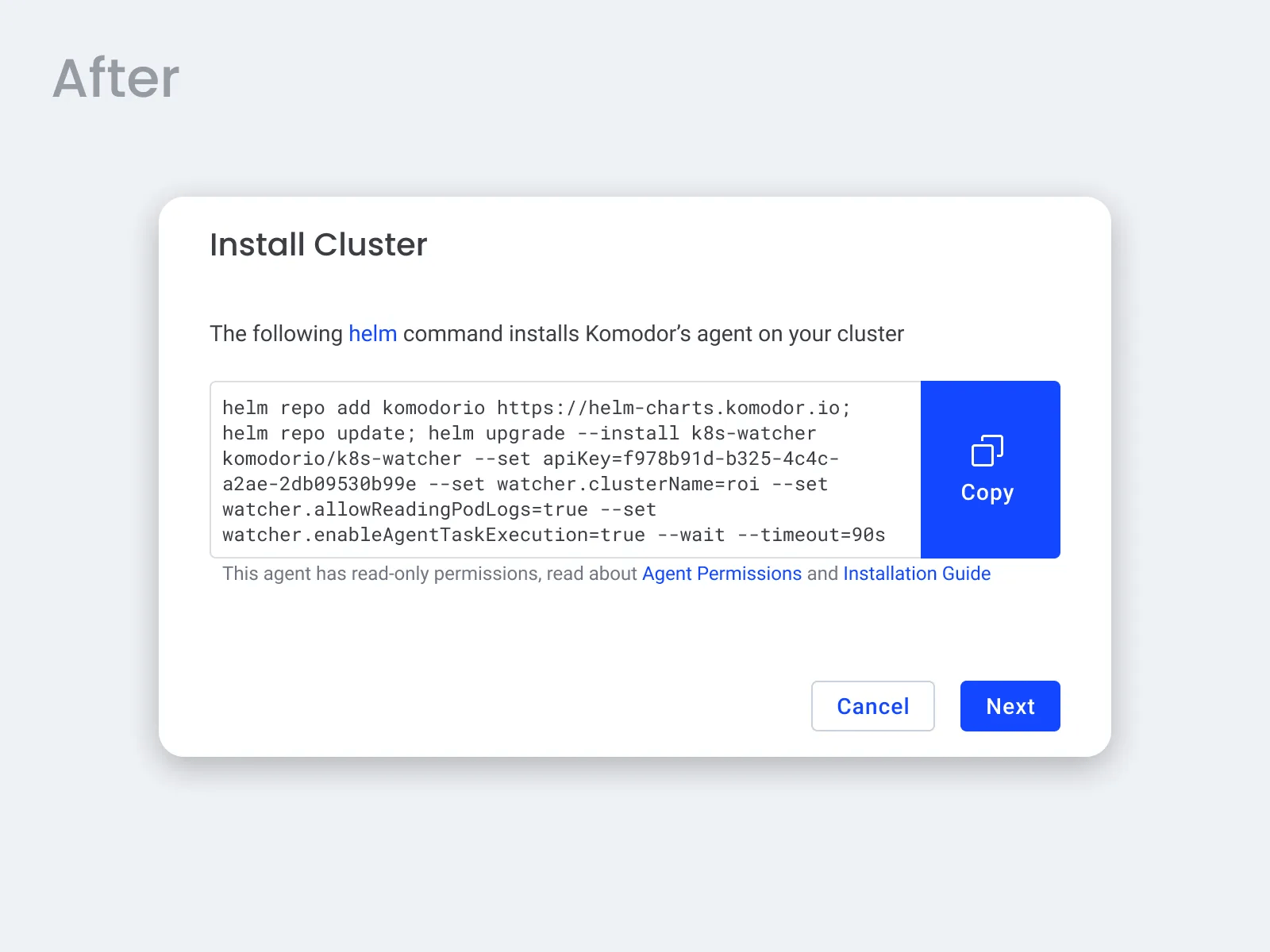
Simplified the texts, and added some reminders that the agent is read-only. I basically removed everything I could from there…
How it improved the situation
Even developers prefer to read less, so by giving them less text to read we improved the conversion at this step. Also, if you know that the agent is read-only, meaning it’s non-destructive, it makes you feel safer about installing it. Design-wise I minimized the number of text styles and types of CTAs.
3. An extra screen in the sign-up process brought the conversion up!
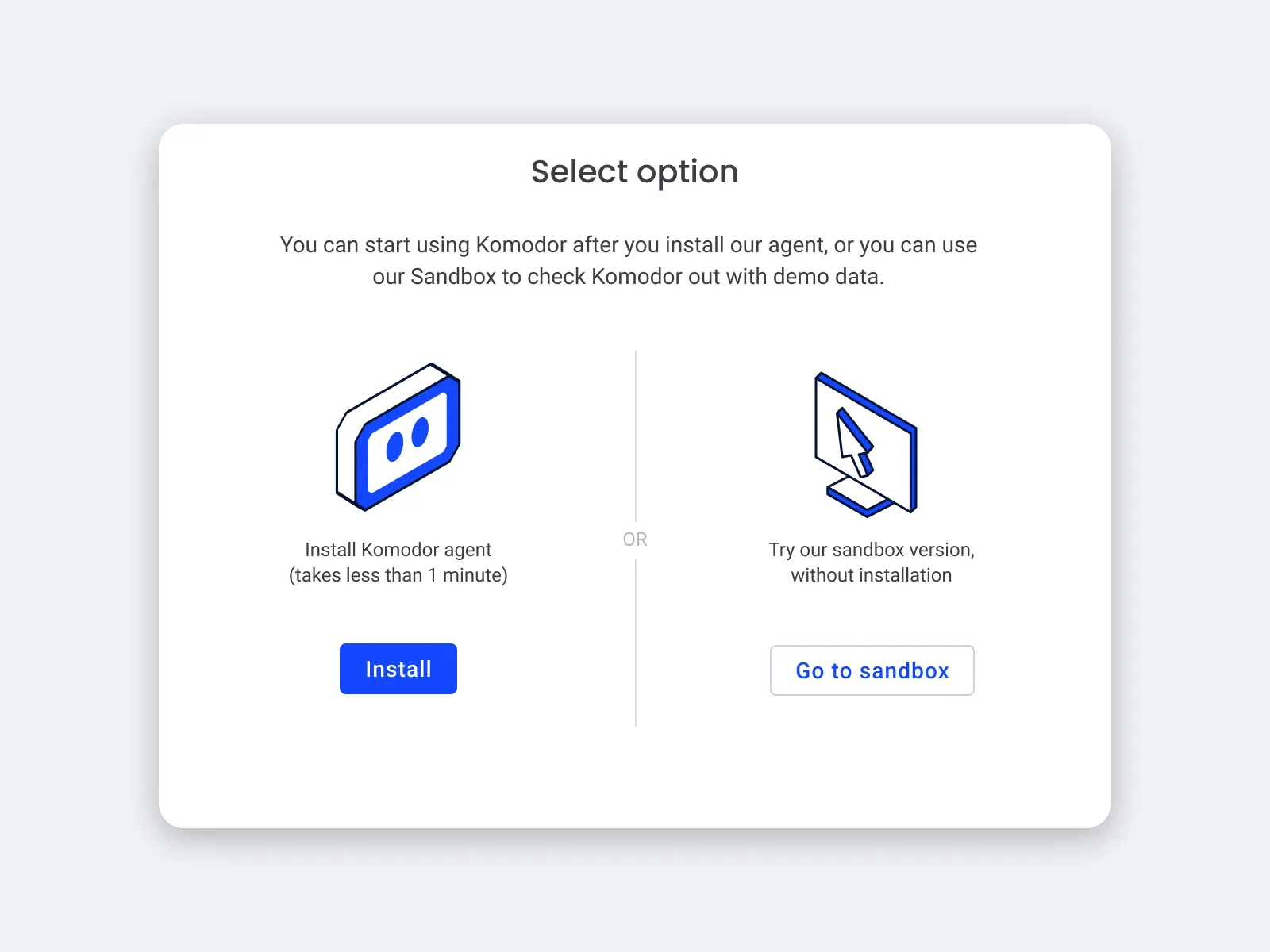
The availability of a test-drive version was not evident enough, so we added an extra screen to the sign-up with a choice. It’s completely counterintuitive for any UX designer to add steps to the sign-up. All designers know — the fewer clicks to achieve a job the better. But, we took the shot and we won! The illustrations alone for this step took me a few days, I tested the balance between the illustrations, buttons, and texts. It looks like a simple screen, and it is, but it’s a turning point in the flow of signing up a user and its role in our mission’s success is very high.
Bringing it all together
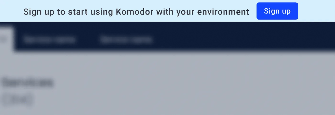
So to loop it all together I added a sandbox call to action to the website, install CTA to the sandbox, and an extra step at the sign-up process to allow a test drive.


Summary
It is essential for companies to strike a balance and offer a manageable number of options during the onboarding process, keeping the users focused and engaged throughout. By creating a positive and enjoyable onboarding experience, SaaS companies can increase adoption and retention and improve their overall success. Onboarding is like wrapping paper, and your product is the gift. Make your SaaS onboarding light, short, and easy to get through.
Project credits
UX/UI Designer: Mark Levinson (that’s me)
Product manager: Ben Rosenfeld
Art director: Roy Weinberg
