Rezilion
Transformed Rezilion’s cybersecurity AI resilience platform into a clear, user-friendly dashboard for security teams, in just 2 days.
Client
Rezilion, a cybersecurity startup specializing in autonomous cloud workload protection.
My role
UI concept, Product Design, UI Design
The challenge
Transforming complex, data-heavy security insights into a clear and actionable UI without overwhelming users
Result
Completed the UI concept in just 2 days. Following the completion of the full product design at 5ive Studio, Rezilion successfully raised $8 million in seed investment. This UI concept laid the foundation for a powerful security tool, helping enterprises make their production environments self-healing and resilient to threats.
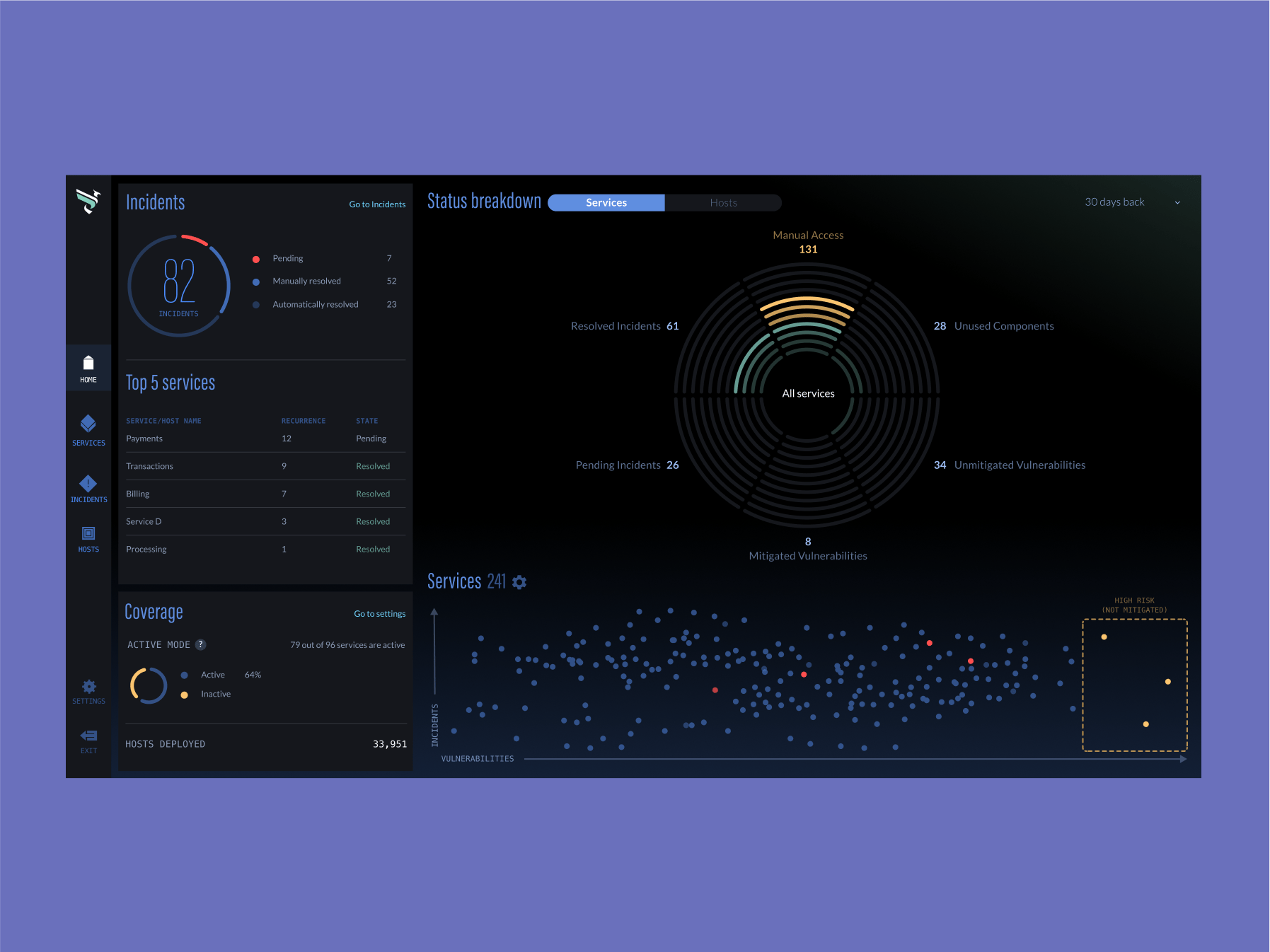
Cross-Chart Navigation
I designed a cross chart navigation and interaction, where clicking a data point dynamically updates the radar chart, revealing detailed insights on security vulnerabilities, mitigations, and risks. This seamless interaction allows security teams to drill down into specific threats while maintaining a clear, high-level overview of system health.
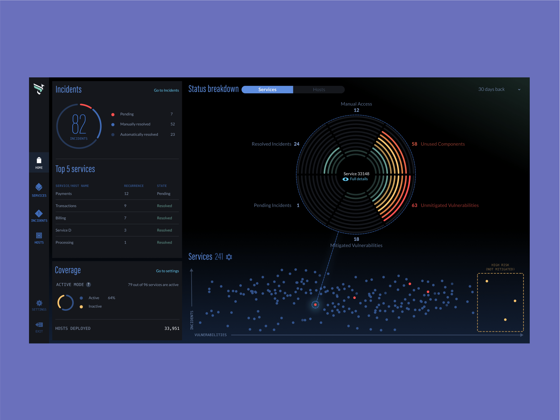
Interactive elements
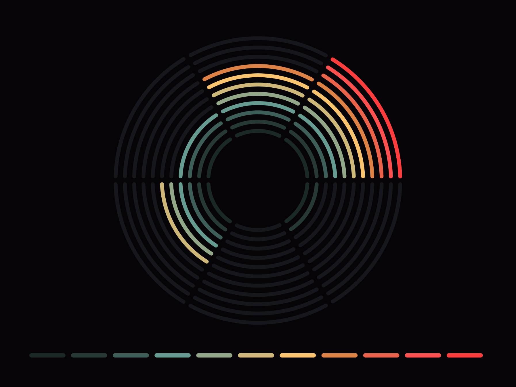
I designed intuitive interactions to enhance usability, including popups, tooltips, and settings menus that provide quick access to key insights without cluttering the interface. The radar-shaped chart was carefully crafted to visualize security data dynamically, allowing teams to assess threats at a glance while maintaining a smooth and engaging user experience.
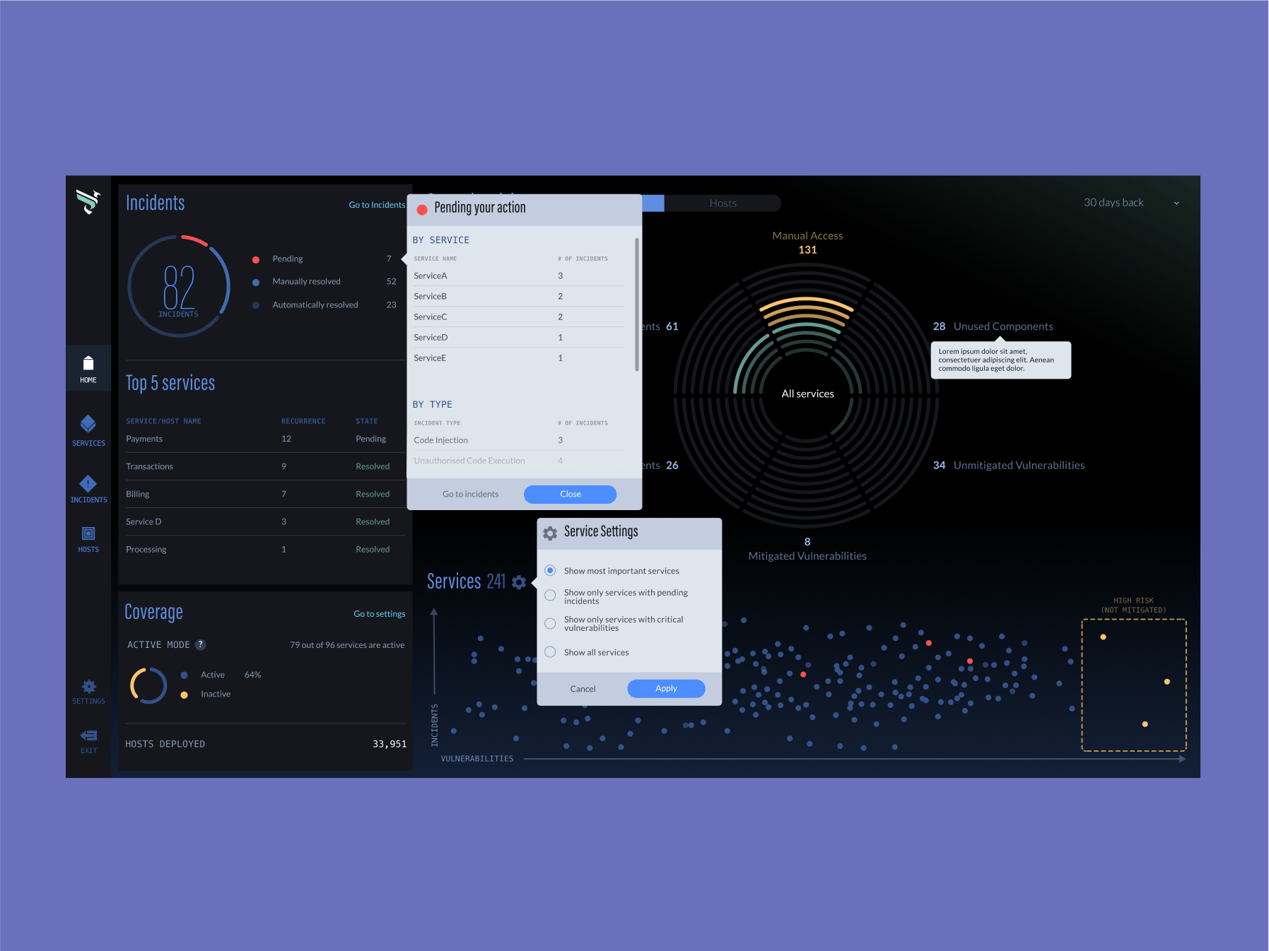
Style guide and design system
Designing the style guide for Rezilion meant creating a visually futuristic yet highly practical system that developers could easily implement. From sleek charts and interactive elements to clean typography and structured layouts, every component was designed for consistency, scalability, and a modern, tech-forward experience.
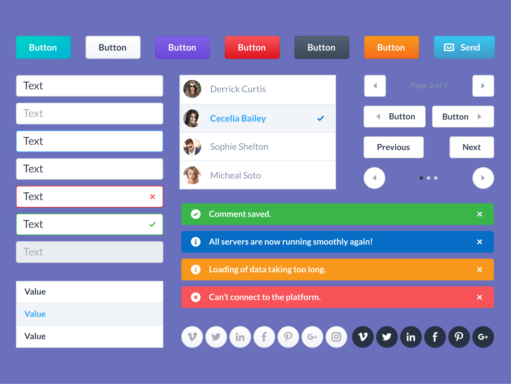

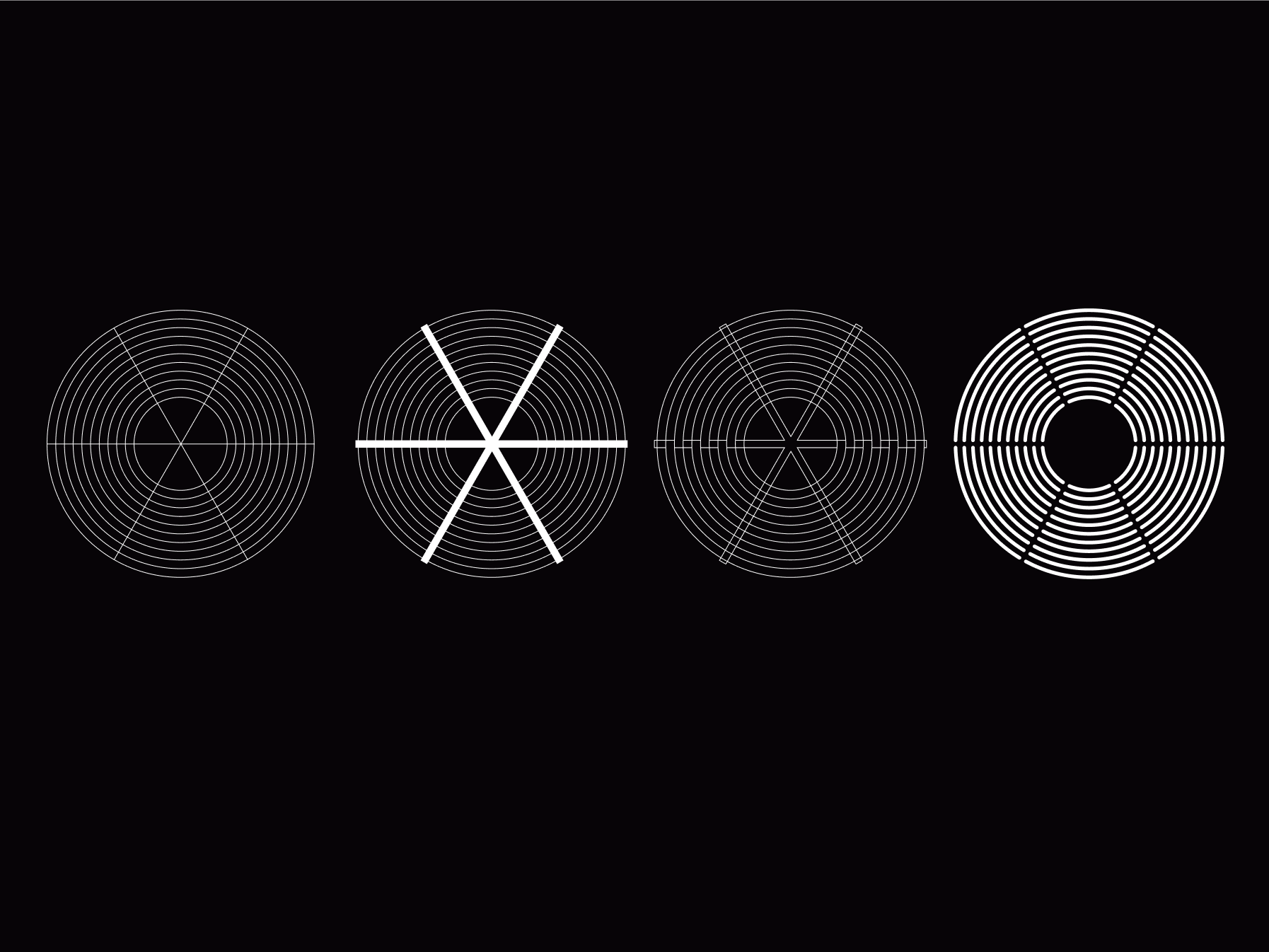
Radar chart
The radar chart provides a dynamic, at-a-glance visualization of security risks, mapping vulnerabilities, mitigations, and system health in an intuitive circular layout.
Final thoughts
By balancing data density with usability, this design helps security teams cut through the noise and focus on what matters most. Thoughtful interactions, adaptive visualizations, and a structured layout turn cybersecurity insights into an intuitive, real-time monitoring experience.
I really enjoyed tackling this challenge—taking complex security data and turning it into something both powerful and easy to use. Seeing the dashboard come to life with dynamic interactions and layered visualizations was incredibly rewarding. This project was a perfect blend of problem-solving, creativity, and technical precision!
